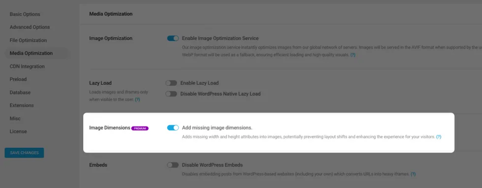
When a browser renders a web page, it initially loads the HTML and then pauses to download the images. If the dimensions for the images are specified, browsers can allocate the necessary space for those images on the page.
If the dimensions for an image aren’t predetermined, then the browser will adjust the existing content to make space for the image as it gets downloaded. These layout changes can result in a less-than-ideal experience for the visitor.
This feature aims to resolve the following suggestions from GTmetrix and PageSpeed Insights:
- Use explicit width and height on image elements
- Cumulative layout shift
How does it work?
Powered Cache checks the HTML output of the page, detects the images that don’t have width and height attributes and alters them by calculating the size.
For example, if your page has
<img src="https://www.example.com/wp-content/uploads/2023/08/dummy-image.jpg">It will be updated like:
<img src="https://www.example.com/wp-content/uploads/2023/08/dummy-image.jpg" width="1024" height="641">Tips:
- If you want to skip a particular image while keeping this feature enabled, you can add
data-skip-image-dimensionsattribute to your image tag. Or usingpowered_cache_skip_adding_missing_image_dimensionsfilter to exclude specific images.
- This feature will not work for logged-in users when logged-in user cache is disabled. (calculating the image size of external resources might take a longer time, which can cause more problems than it solves)